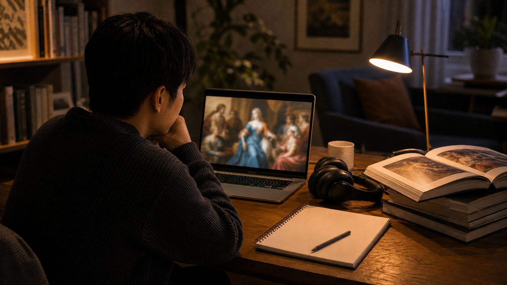
This week’s YouTube pick is The Great Wave by Hokusai: Great Art Explained. It is the kind of video that does something deceptively difficult: it takes an image almost everyone recognises and makes it feel strange, deliberate and alive again.
Hokusai’s wave is one of the most reproduced images in the world. It appears on posters, tote bags, phone cases, T-shirts, notebooks and countless design references. Familiarity can flatten it. We start seeing “the famous wave” rather than a woodblock print made inside a specific artistic, commercial and historical world. The value of this video is that it slows the image down.
What makes the video work
Great Art Explained is good at joining visual analysis with context. The video does not treat the print as a museum object sealed behind glass. It looks at composition, movement, scale, printing, colour, cultural exchange and the strange emotional balance of the image: danger and beauty, force and pattern, human vulnerability and formal control.
The wave is not simply large. It is designed to feel as if it is about to collapse over the boats. Mount Fuji, often imagined as the subject of the series, sits small and distant. The human figures are present but nearly swallowed by the rhythm of water. That spatial drama is why the image still works even when reduced to a thumbnail. It has a structure that survives reproduction.
Why famous art needs this kind of explanation
There is a common mistake in art viewing: assuming that if an image is famous, its meaning must be obvious. In fact, fame can make looking harder. We recognise before we observe. We remember the brand of the image rather than the choices inside it. A good explainer video gives permission to look again without embarrassment.
This matters beyond art history. Many public images today move too quickly for careful attention. We scroll past photographs, memes, war footage, campaign ads, AI images and design references at speed. Learning to study a single print teaches a larger habit: ask how the image is built, what it emphasises, what it hides, and why it affects us.
What to notice while watching
- The scale trick.Notice how the wave, boats and Mount Fuji create a triangle of fear, movement and distance.
- The line work.The wave is violent, but the print’s lines are controlled and almost musical.
- The colour.Blue is not just decoration; it is part of the print’s modernity and global afterlife.
- The commercial context.This was not only a sacred masterpiece. It was also a printed object made for circulation.
The last point is especially useful. We often separate high art from popular media, but Hokusai’s print travelled because it was reproducible. Its later global fame belongs partly to that reproducibility. In a way, YouTube is an appropriate place to rediscover it: another mass medium explaining an earlier mass medium.
Who should watch it
Watch it if you like art history but do not want a lecture that feels locked inside specialist vocabulary. Watch it if you teach, design, draw, photograph or simply want a better way to spend a short break than letting the algorithm choose noise for you. It is also a useful family watch for older children and teenagers because the image is already familiar enough to provide an easy entry point.
The video is not a replacement for seeing prints in person, reading deeper scholarship or learning about Edo-period Japan in full. It is an invitation. Its strength is focus. By staying with one image, it reminds viewers that attention can be pleasurable, not only educational.
Recommendation: watch the video once normally, then pause on the print and look at it for a full minute without multitasking. The wave will probably stop being a logo and become a scene again. That is a small but satisfying repair.
Source: Great Art Explained on YouTube.